Tell me something, would you step into a river that is on average 4 feet deep? Take a pause. If your mind shouted NO right away, you don’t need to look at this illustration:
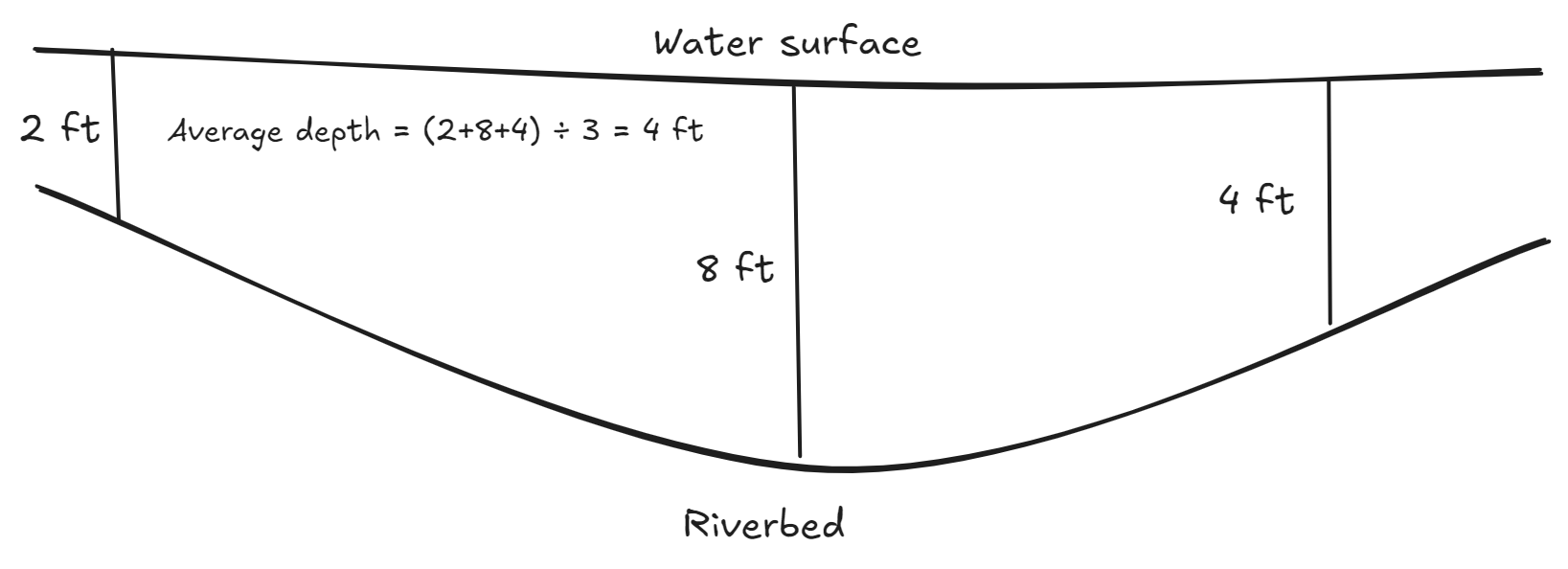
Averages are tricky. Most of the times, they play with our intuition and lead us to bad decisions.
One of my favourite averages is the recent Securities and Exchange Board of India’s (SEBI) research outcome: approximately 93% of equity derivative traders have incurred an average loss of Rs 2 lakh (per trader) during the last three financial years. Imagine some of the deadly depths of this loss river!
Now, that’s a river I wouldn’t dare step into without expertise. In any case, the knowledge work that most of us are involved doesn’t contain derivative trading or stepping into rivers. But many of us deal with dashboards everyday.
Dashboard mania
Most of the organizations have been in frenzy to have dashboards for sometime now. This began a few years back due to increased computing power of PCs, better internet connectivity and upgradation of technology stack of webpages. A few months back, we had discussed different aspects of the problems with dashboards and mistakes in 5 mistakes I avoid while designing my dashboards
The three problems I had highlited were:
- Dashboards are treated as cure to all problems
- Only for managers
- Gap between decision-maker and decision
But the main problem: averages
Other organizational, humane and management problems aside, the main problem is that most dashboards show averages. Consider this image that I had shared in the said letter:
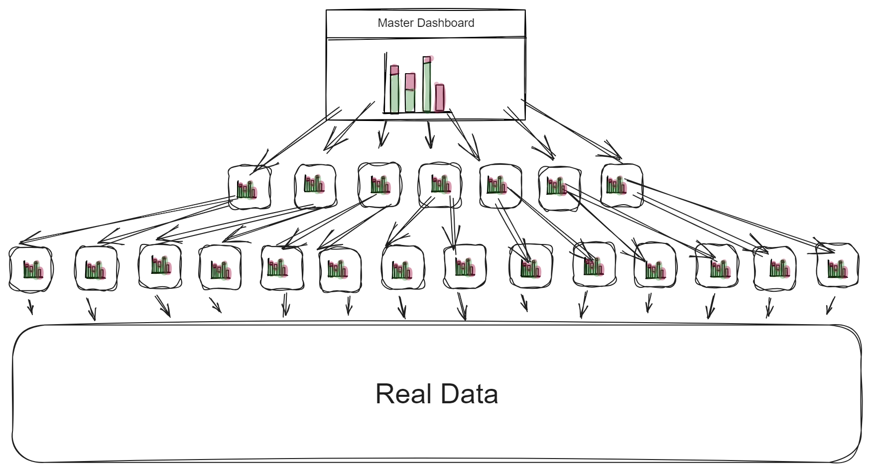
In your business, the real data might be coming from 100 different locations from a large geographic area. As a business owner or a high-level manager, the dashboard would be providing an aggregate, average idea of the the business activity health.
4-feet depth on display
Your dashboard shows you the 4 feet depth of the river. Of course, the modern dashboards provide the facility to drill several levels deeper (but how often do you click 5 levels deep and corroborate the data?).
In other words, dashboards tend to do two things:
1. Making good business look bad
If the average sales data of your 50 sales people show bad business, that overshadows the good business brought in by the individuals.
2. Making bad business look good
On the other hand, if the average sales data of your 50 sales people show good business, it hides the bad business brought in by the individuals. In essence, averages play with our intuition, mood and consequently decision-making.
So what’s the solution?
Giving more power to your people. By investing in design that provides a personalized experience. Most importantly, details that don’t show averages.
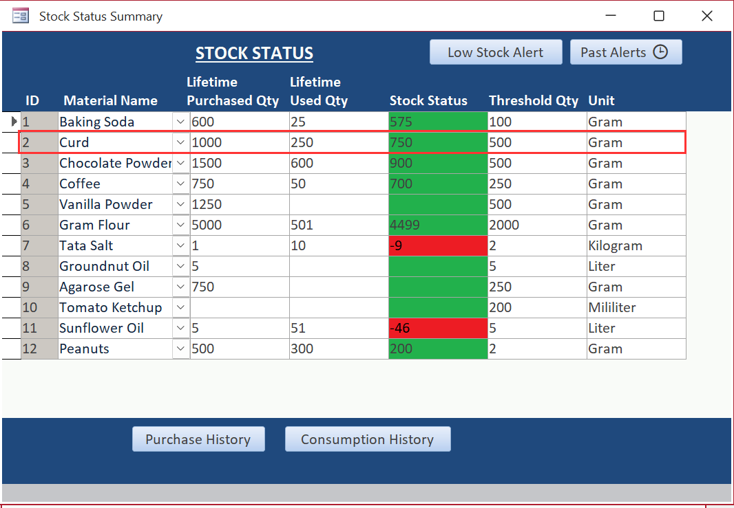
Look at this stock management screen I created sometime back. Ignore the discrepancy in the sample data and look at the quantity of Curd. It doesn’t tell person that 75% curd is available. Instead, it tells the person that the curd status is GREEN at the moment and it is 750 gram. The person will make necessary the decision depending on this information.
Averages can mislead, whether in rivers or dashboards. They hide extremes, skew decisions, and cloud judgment. The solution? Empower people with detailed, personalized data—not just averages. Dive deeper, design smarter, and make decisions that reflect reality, not illusions.
Want to create an efficient data system?
It is difficult to create a data system on your own. What works for a fortune 500 company may not work for your business. Each business is unique. That is what we do. We understand your processes, suggest changes and create data system that works for you.
See how we do it and get started with us:
While you check out other case studies and our processes, I want to invite you to join our semi-regular free email letters.