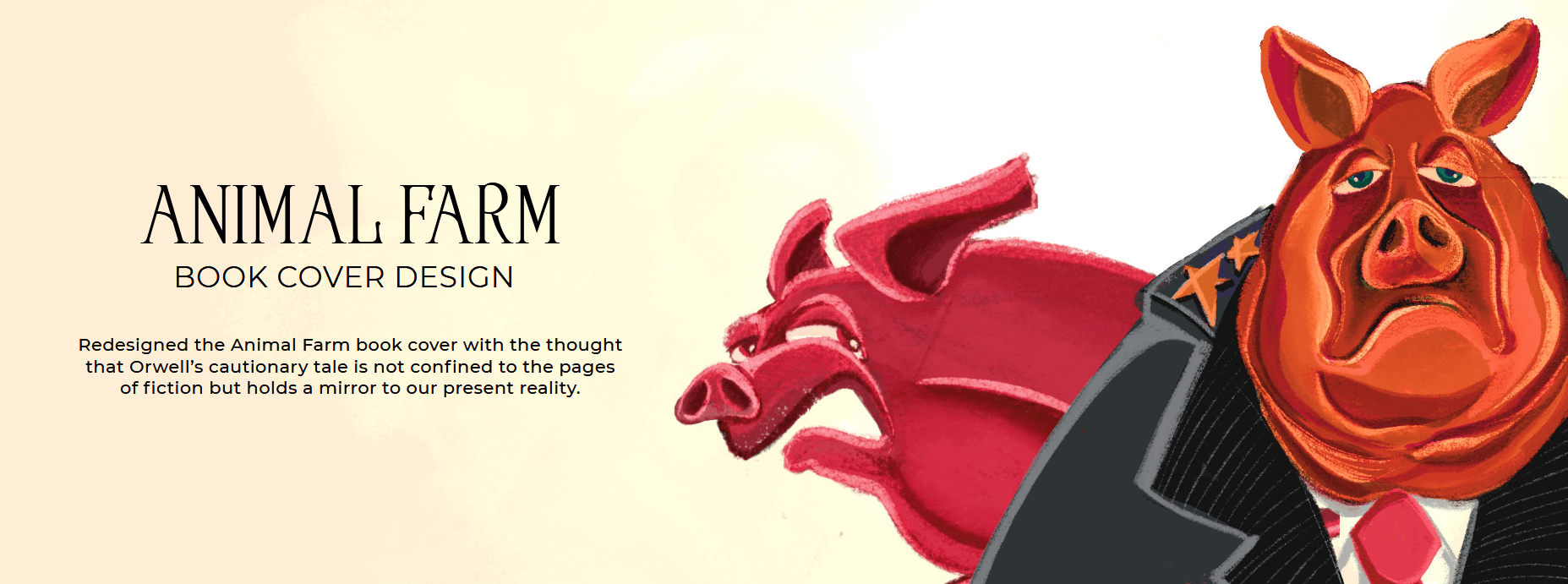
Animal Farm is a classic book authored by George Orwell. After reading it, I wanted to illustrate my impression in form of a book cover.
You can see some of the process steps that we have laid out in our illustration design practice.
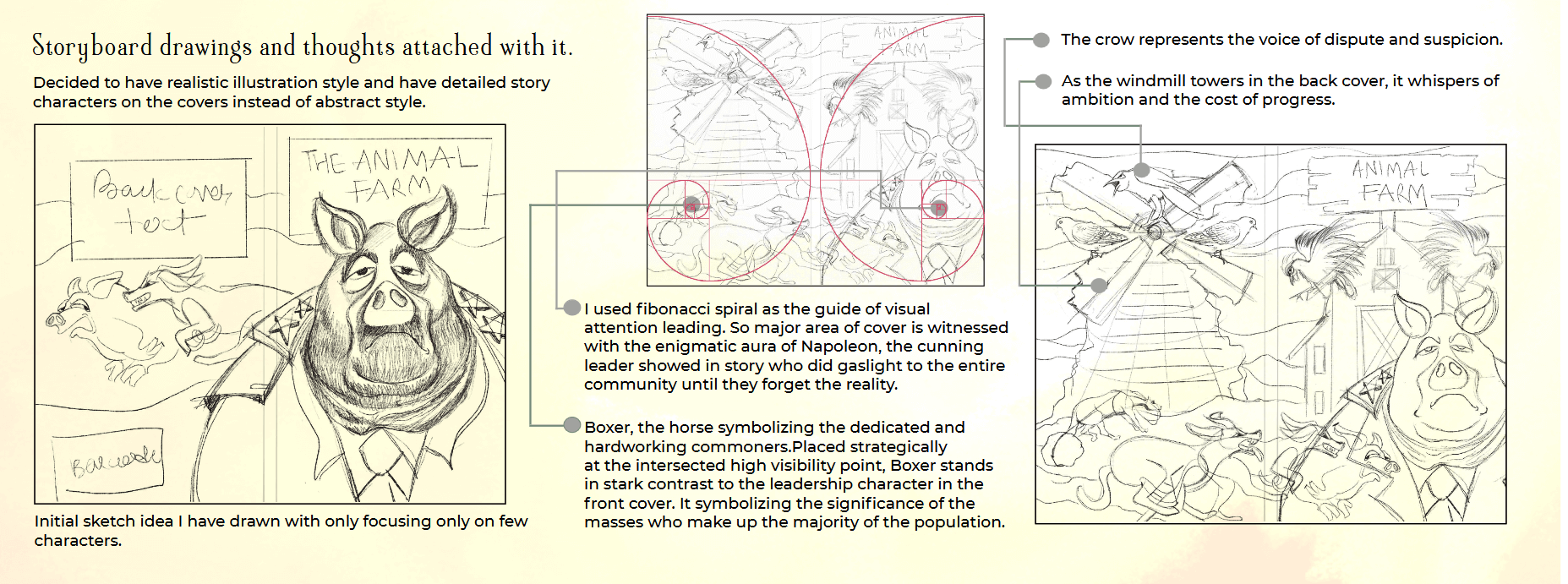
Glimpses of storyboards and design decisions that I made:
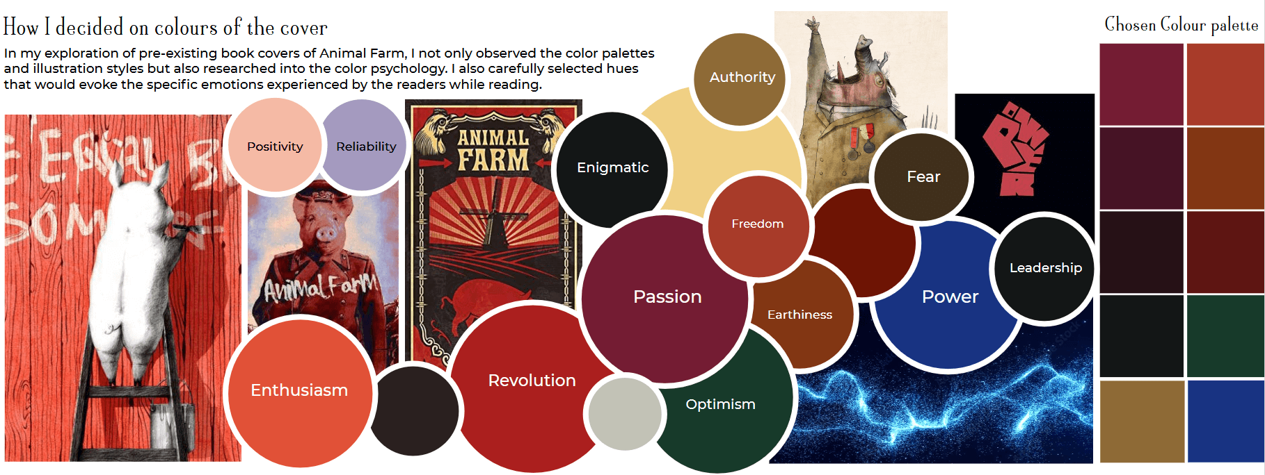
For colour palette, I referenced past book covers. You can see the recurring theme of colours in all book covers. Because they evoke specific emotions that you feel after reading Animal Farm.
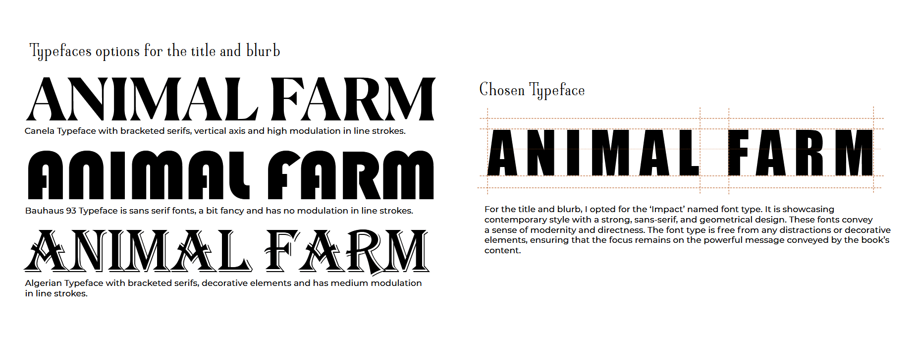
Orwell’s style is direct, incisive, almost brutal. I chose the Impact typeface to convey the message.
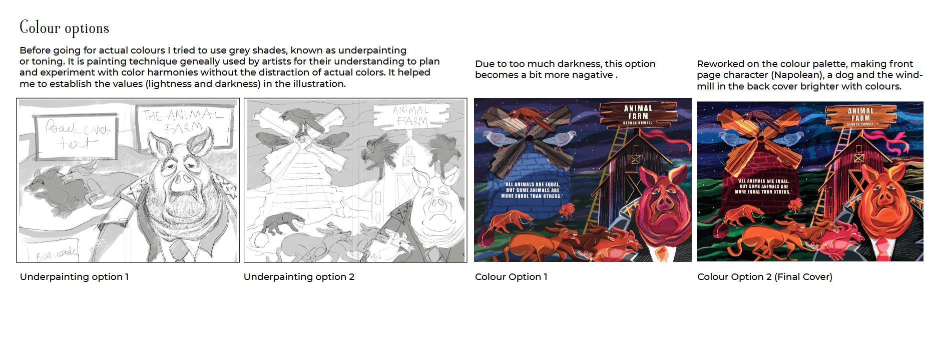
Sometimes, we don’t go for colouring right away. And experiment with “underpainting” technique. Eventually, I chose a brighter shade.
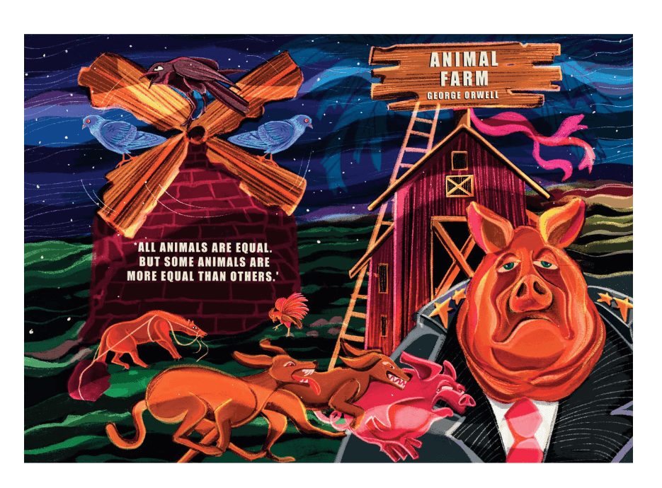
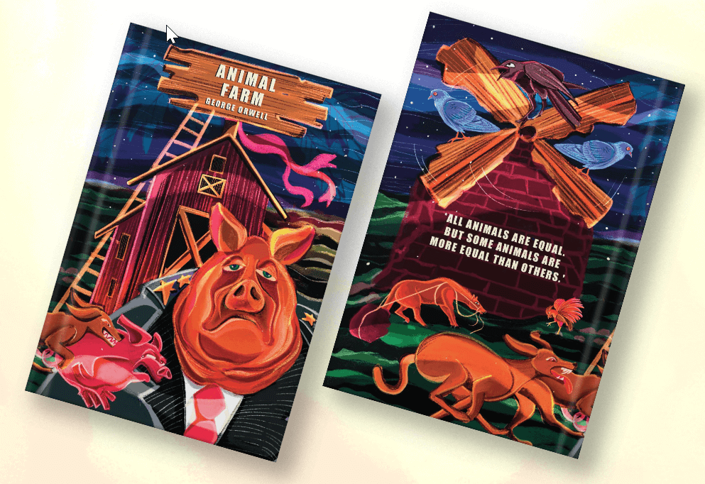
The final book cover looked like this:
Want to illustrate your own book cover?
As you can see, illustration design is neither exact science nor exact art. It employs high degree of emotional labour. And that’s what we do.
See how we do it and get started with us:
While you check out other case studies and our processes, I want to invite you to join our semi-regular free email letters.